SAS 比較讓人詬病的一點是繪圖程式相當困難,比較複雜一點的圖形可能用現成的 SAS/GRAPH 程序做不出來。但其實應該是沒有 SAS 做不出來的圖,端看使用者有沒有辦法熟用程式的運用。很多基本的製圖設定,看手冊是可以學的起來。但比較關係到細部設定的程式,若沒有人指點,翻遍手冊也找不到解決的方法。Michael G. Eberhart 在 2006 年的 NESUG 發表了一篇篇幅不短的教學文章,可以視為讓進階使用者能夠快速對 SAS/GRAPH 進階用法入門的一個良好的教學。
COMBINING PLOT LINE AND BAR CHART
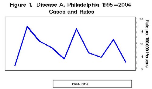
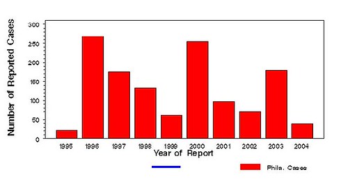
有時候我們習慣在一個柱狀的趨勢圖上再加上折線圖,如下圖所示:

折線圖主要適用 PROC GPLOT,而柱狀圖主要是用 PROC GCHART,要如何將兩種不同程序所做出的圖形重疊在一起,就是一門學問了。以下利用一個小範例來說明該如何繪製這類的圖形。首先,使用的資料如下所示:
data disacases;
input rate numcase year ;
datalines;
1.3 21 1995
16.9 269 1996
11.0 175 1997
8.4 133 1998
3.9 62 1999
16.0 255 2000
6.4 98 2001
4.6 70 2002
11.7 179 2003
2.6 39 2004
;
首先,先用 PROC GPLOT 把折線圖畫出來,程式如下:
goptions reset=all device=png htext=8pt;
axis1 order=(0 to 20 by 5) value=none origin=(20,20) pct length=57 pct
label=none major=none minor=none;
axis2 order=(1995 to 2004 by 1) value=none origin=(,22.5) pct length=70 pct
label=none major=none minor=none offset=(4,4);
axis3 order=(0 to 20 by 5) origin=(90,20) pct length=57 pct value=(f=swissb)
label=(a=270 h=11pt f=swissb "Rate per 100,000 Persons");
title f=swissb h=14pt move=(17,23) "Figure 1. Disease A, Philadelphia 1995-2004";
title2 f=swissb h=14pt move=(33,21) "Cases and Rates";
symbol1 color=blue interpol=join /*sets color and joins markers in a line*/
line=1 /*sets type of line e.g. solid, dashed, etc*/
width=4 value=none; /*sets width and assigns unique symbol*/
symbol2 color=blue interpol=join line=1 width=4 value=none;
legend1 across=2
down=1
cborder=black
position=(bottom right outside)
mode=protect
label=none
offset=(-2cm,)
value=(h=8pt f=swissb justify=right 'Phila. Rate');
proc gplot gout=work.gseg data=disacases;
plot rate*year / overlay vaxis=axis1 haxis=axis2 legend=legend1;
plot2 rate*year / overlay vaxis=axis3 legend=legend1;
run;
quit;
座標軸(axis)的語法和說明:
- Order:可以指定標示在座標軸上數據的起點、終點和間距。如:order=(0 to 20 by 5) 就表示座標軸從 0 開始,每五格標示一次(5、10、15),直到終點 20。
- Major:控制大間距刻度是否出現,本例設定是 none,就代表隱藏大間距刻度。
- Minor:控制小間距刻度是否出現,本例設定是 none,就表示隱藏小間距刻度。
- Value:修改間距標示所顯示的值,本例設定是 none,就表示不做調整。
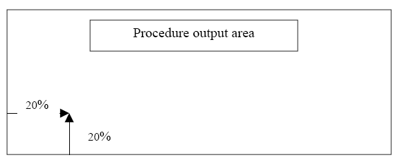
- Origin:控制座標軸在圖上開始繪製的起點。本例的縱軸(axis1)設定是(20, 20),表示該軸是從圖形展示介面從下方和從左方算起的第 20% 的位子開始描繪,詳情請見下圖。。橫軸(axis2)設定是(,22.5)表示在橫軸下方挪出 22.5(單位不明)的空間。
- Length:決定座標軸的長度。
- Label:決定座標軸的標籤。其中,a 可以決定文字角度,h 可以決定文字大小,f 可以決定文字字形。
- Offset:決定折線起點距離座標軸原點的位置。
圖示說明(legend)的語法和說明:
- across:定義圖示說明內的欄位數量。
- down:定義圖示說明內的列位數量。
- position:決定圖示說明的位置。
- mode:宣告被圖示說明佔據的空間不得被其他元件使用。
- offset:定義圖示說明的細部位置(類似 axis 的 offset)。
- value:設定圖示說明的字形和字體大小。
- color:點的顏色。
- interpol:點的連結狀態(none 表示不連結,j 表示連結)。
- line:連結線的樣式(請參考手冊,大概有二三十種)。
- width:線的寬度。
- value:點的樣式(請參考手冊,大概也有十來種)。
- height:點的大小。
折線圖畫好後,就可以開始繪製柱狀圖。在此之前,有些額外的元件需要用 annotate 來設定。程式如下所示:
data anno;
length function color style $8 position $1 text $20;
retain xsys '5' ysys '5' when 'a';
function='move'; x=46.8; y=7; output;
function='bar'; x=54; y=6; color='blue'; style='solid'; output;
function='move'; x=69; y=8;output;
function='bar'; x=74; y=5;color='red'; style='solid'; output;
function='move'; x=80; y=3;output;
function='label'; style='swissb'; text='Phila. Cases'; color='black'; size=.8;
position='2';output;
function='move'; x=55; y=9;output;
function='label'; style='swissb'; text='Year of Report'; color='black'; size=1;
position='2';output;
run;
語法說明如下:
- XSYS 和 YSYS:這是設定座標軸系統的變數名稱,有不同的代碼,詳情需查詢 SAS 手冊才能瞭解各代號的意義。
- when:表示 annotate 繪製的時間,a 表示先畫圖再畫 annotate,b 表示先畫 annotate 再畫圖。
- position:表示文字字串的位置。
- style:在 function='bar' 下表示指定 bar 的形式,在 function='label' 下表示指定 label 的形式。
- function:表示想要進行的動作。有 move、bar、label、pie 等功能可用。
- color 和 size:指定圖形或文字的顏色和大小。
goptions reset=all device=png htext=8pt;
axis1 order=(0 to 300 by 50) value=(f=swissb)origin=(20,20)pct length=57 pct
label=(a=90 h=11pt f=swissb "Number of Reported Cases ");
axis2 order=(1995 to 2004 by 1) value=(f=swissb) origin=(,22.5)pct length=70 pct
label=none;
proc gchart data=disacases gout=work.gseg;
vbar year /sumvar=numcase
raxis=axis1
space=1
maxis=axis2
discrete
annotate=anno;/*identifies the annotate dataset*/
run;
quit;
PROC GCHART 的參數說明如下:
- raxis:指定 Y 軸。
- space:指定 bar 與 bar 之間的距離。
- maxis:指定 X 軸。
- discrete:定義 X 軸的變數是離散變數。
- annotate:呼叫之前寫的 annotate 資料集。
最後,用 PROC GREPLAY 把兩張圖何在一起,程式如下:
filename figures "d:\nesug\nesug_disease_a.png"; /*output destination*/
goptions reset=all device=png gsfname=figures htext=8pt
xpixels=3600 ypixels=2400 lfactor=6
/*settings for xpixels and ypixels generates image at 600dpi*/
/*lfactor (line factor) is increased by a factor of 6*/
xmax=6.4in ymax=3.4in hsize=6.4in vsize=3.4in;
proc greplay igout=work.gseg nofs tc=sashelp.templt template=whole;
treplay 1:gchart
1:gplot;
run;
quit;
GREPLAY 的語法說明:
- igout:指定圖形輸出設定所需的 SAS 資料夾。
- nofs:抑制 SAS 預設的設定。
- tc=sashelp.templt:SAS 有提供許多模版,全部放在 sashelp.templt 這個資料夾裡面,必須要用 tc 指令指定才能使用。
- template=whole:指定輸出模版,whole 表示全部的圖都放在同一個模版下。
- treplay statement:指定哪些圖形使用哪些模版。如果每個輸出圖形所指定的模版都一樣,就表示把圖形疊在一起顯示。如範例所示。
proc greplay igout=work.gseg nofs; delete _all_;run;DOUBLE REVERSE HBAR GRAPH
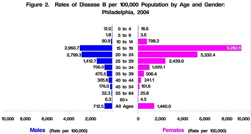
這種圖形有點像金字塔圖。大概長的像這個樣子:
這次用的資料如下:
data disbrate;
input frate mrate agegrp $;
datalines;
16.6 12.0 0-4
3.6 1.8 5-9
798.2 90.9 10-14
9282.6 2960.7 15-19
5332.4 2799.3 20-24
2439.0 1412.7 25-29
1029.1 706.0 30-34
506.4 475.5 35-39
241.1 305.8 40-44
101.6 176.0 45-54
25.8 52.3 55-64
4.5 6.3 65+
1440.0 712.5 All
;
run;
proc format;
value $agrp '0-4'=' 0 to 4 '
'5-9'=' 5 to 9 '
'10-14'='10 to 14'
'15-19'='15 to 19'
'20-24'='20 to 24'
'25-29'='25 to 29'
'30-34'='30 to 34'
'35-39'='35 to 39'
'40-44'='40 to 44'
'45-54'='45 to 54'
'55-64'='55 to 64'
'65+'=' 65+ '
'All'='All Ages';
run;這個資料並沒有辦法直接套用到繪圖上,而是要先做一點整理。這邊我們利用 PROC TRANSPOSE 的語法將資料作一點轉置的動作。
/*Transpose dataset to create individual variables for each age group*/
proc transpose data=disbrate out=disbanno;
id agegrp; var frate mrate;
format agegrp $agrp.;
run;
/*Make male rates negative and apply format*/
data disbrate; set disbrate;
mrate=-mrate;
format agegrp $agrp.;
run;
接著,仍舊是要設定 annotate 資料集,而且一次要做兩個(一邊用一個):
/*First annotate dataset for female rates graph*/
data anno1;
length function style color $8 position $1 text $20;
retain xsys '1' ysys '1' when 'a' style 'swissb' position '8' size .8;
set work.disbanno;
where _name_='frate';
function='move'; x=2; y=102;output;
function='label'; text=(put(_0_to_4,comma8.1)); color='black';output;
function='move'; x=0; y=95; output;
function='label'; text=(put(_5_to_9,comma8.1)); color='black';output;
function='move'; x=11; y=88; output;
function='label'; text=(put(_10_to_14,comma8.1)); color='black';output;
function='move'; x=84; y=80; output;
function='label'; text=(put(_15_to_19,comma8.1)); color='white';output;
function='move'; x=61; y=72; output;
function='label'; text=(put(_20_to_24,comma8.1)); color='black';output;
function='move'; x=33; y=65; output;
function='label'; text=(put(_25_to_29,comma8.1)); color='black';output;
function='move'; x=17; y=58; output;
function='label'; text=(put(_30_to_34,comma8.1)); color='black';output;
function='move'; x=9; y=50; output;
function='label'; text=(put(_35_to_39,comma8.1)); color='black';output;
function='move'; x=7; y=43; output;
function='label'; text=(put(_40_to_44,comma8.1)); color='black';output;
function='move'; x=4; y=36; output;
function='label'; text=(put(_45_to_54,comma8.1)); color='black';output;
function='move'; x=2; y=28; output;
function='label'; text=(put(_55_to_64,comma8.1)); color='black';output;
function='move'; x=0; y=21; output;
function='label'; text=(put(_65P,comma8.1)); color='black';output;
function='move'; x=22; y=13; output;
function='label'; text=(put(All_Ages,comma8.1)); color='black';output;
run;

/*Second annotate dataset for male rates graph*/
data anno2;
length function style color $8 position $1 text $20;
retain xsys '1' ysys '1' when 'a' style 'swissb' position '8' size .8 color
'black';
set work.disbanno;
where _name_='mrate';
function='move'; x=90; y=102;output;
function='label';text=(put(_0_to_4,comma8.1));output;
function='move'; x=90; y=95; output;
function='label';text=(put(_5_to_9,comma8.1));output;
function='move'; x=89; y=88; output;
function='label';text=(put(_10_to_14,comma8.1));output;
function='move'; x=61; y=80; output;
function='label';text=(put(_15_to_19,comma8.1));output;
function='move'; x=63; y=72; output;
function='label';text=(put(_20_to_24,comma8.1));output;
function='move'; x=77; y=65; output;
function='label';text=(put(_25_to_29,comma8.1));output;
function='move'; x=83; y=58; output;
function='label';text=(put(_30_to_34,comma8.1));output;
function='move'; x=85; y=50; output;
function='label';text=(put(_35_to_39,comma8.1));output;
function='move'; x=87; y=43; output;
function='label';text=(put(_40_to_44,comma8.1));output;
function='move'; x=88; y=36; output;
function='label';text=(put(_45_to_54,comma8.1));output;
function='move'; x=89; y=28; output;
function='label';text=(put(_55_to_64,comma8.1));output;
function='move'; x=90; y=21; output;
function='label';text=(put(_65P,comma8.1));output;
function='move'; x=83; y=13; output;
function='label';text=(put(All_Ages,comma8.1));output;
function='move'; x=1; y=0;output;
function='bar'; x=0; y=100;color='white';output;
run;
然後設定一個 format 讓負值顯示成正值:
/*Create picture format to display negative values as positive*/
proc format;
picture positive low-high='000,000';
run;
然後用 PROC GCHART 來畫第一張圖,並把那兩個 annotate 中的 anno1 套用上先:
goptions reset=all device=png htext=8pt ftext=swissb;
axis1 order=(0 to 10000 by 2000) value=(f=swissb)origin=(55,17.3)pct length=45pct
label=(c=cxFF00FF f=swissb h=10pt 'Females' h=8pt c=black ' (Rate per 100,000)') mino=none;
axis2 order=(' 0 to 4 ' ' 5 to 9 ' '10 to 14' '15 to 19' '20 to 24' '25 to 29' '30 to 34' '35
to 39' '40 to 44' '45 to 54' '55 to 64' ' 65+ ' 'All Ages') value=(j=c f=swissb)
origin=(55,17.3)pct label=none minor=none length=65pct;
title h=10pt 'Figure XX. Rates of Disease B per 100,000 Population by Age and Gender:';
title2 h=10pt 'Philadelphia, 2004';
pattern1 value=solid color=cxFF00FF; /*color set with RGB values*/
proc gchart data=disbrate gout=work.gseg;
hbar agegrp /sumvar=frate
raxis=axis1 /*sets vertical axis*/
space=.25 /*controls space between bars*/
maxis=axis2 /*sets horizontal axis*/
discrete
nostats /*suppress stats*/
noframe /*suppress frame around graph*/
width=1 /*controls width of bars*/
annotate=anno1; /*identifies annotate dataset*/
format _numeric_ comma6.; /*sets format for all numeric variables*/
run;
quit;
再寫一個額外的資料集把一些顏色的設定給補好:
data hex;
length red green blue 3.;
red=255;
green=0;
blue=255;
color=COMPRESS('CX'||put(red,hex2.)||put(green,hex2.)||put(blue,hex2.));
run;
最後把 anno2 也套進去畫第二張:
goptions reset=all device=png htext=8pt ftext=swissb;
axis1 order=(-10000 to 0 by 2000) value=(f=swissb)origin=(1.4,17.3)pct length=44pct
minor=none label=(c=cx0000FF f=swissb h=10pt 'Males' h=8pt c=black ' (Rate per 100,000)');
axis2 order=(' 0 to 4 ' ' 5 to 9 ' '10 to 14' '15 to 19' '20 to 24' '25 to 29' '30 to 34' '35
to 39' '40 to 44' '45 to 54' '55 to 64' ' 65+ ' 'All Ages') value=none origin=(1.4,17.3)pct
label=none minor=none length=65pct;
title;
pattern1 value=solid color=cx0000FF; /*color set with RGB values*/
proc gchart data=disbrate gout=work.gseg;
hbar agegrp /sumvar=mrate
raxis=axis1 /*sets vertical axis*/
space=.25 /*controls space between bars*/
maxis=axis2 /*sets horizontal axis*/
discrete
nostats /*suppress stats*/
noframe /*suppress frame around graph*/
width=1 /*controls width of bars*/
annotate=anno2; /*identifies annotate dataset*/
format _numeric_ positive.; /*sets format for all numeric variables*/
run; quit;
這樣就完成了嗎?當然還沒。是有美中不足的地方,那就是標題只有顯示在左圖,但我們需要他「跨圖置中」。這個動作可再度透過 GREPLAY 來完成:
filename figures "d:\nesug\nesug_disease_b.png"; /*output destination*/
goptions reset=all device=png gsfname=figures htext=8pt
xpixels=3600 ypixels=2400 lfactor=6
/*settings for xpixels and ypixels generates image at 600dpi*/
/*lfactor (line factor) is increased by a factor of 6*/
xmax=6.4in ymax=3.4in hsize=6.4in vsize=3.4in;
proc greplay igout=work.gseg nofs tc=sashelp.templt template=whole;
treplay 1:gchart
1:gchart1;
run;
quit;
這個階段完成後才是最終極的完成品!!
VERTICAL BAR CHART WITH GROUPS
這種圖其實 EXCEL 就可以做出來了,如下圖所示:
我們套用上例的資料。先用個 PROC FORMAT 把年齡分群格式做好:
proc format;
value agefmt 0='0-9'
1='10-19'
2='20-29'
3='30-39'
4='40-49'
5='50-59'
6='60-69'
7='70+'
;run;
接著用 PROC SUMMARY 把資料作一些整合,並把結果存成另一個新得資料集名為 totals:
proc summary data=discdata.arcount; class sex agecat; output out=totals;
run;
按照慣例,還是先做一個 annotate 資料集:
/*Create annotate dataset to place N=_freq_ on the graph and label midpoint axis*/
data anno;
length function style color $8 position $1 text $20;
retain function 'label' x 10 y 8 xsys '5' ysys '5' when 'a';
set work.totals;
where sex=' ' and agecat=.;
function='label'; style='swissb'; text=compress('N='||(put(_freq_,comma6.))); color='black';
size=1; position='8'; cborder='black';output;
function='move'; x=x+46; y=y; output;
function='label'; position='8'; style='swissb';cborder='white';text='Age Group (Years)';
color='black';size=1;output;
run;
然後就可以套用主程式繪圖了:
goptions reset=all device=png ftext=swissb htext=8pt;
axis1 order=(0 to 1400 by 200) value=(f=swissb h=11pt) minor=none label=(h=11pt f=swissb angle=90 'Number of Reported Cases');
axis2 minor=none value=none label=none;
axis3 order=(0 to 7 by 1) minor=none value=(h=11pt f=swissb) label=none;
legend1 across=1 /*Number of columns across*/
down=2 /*number of columns down*/
cborder=black /*draws a black border around legend*/
position=(top left inside)
mode=protect /*allows legend to cover space within plot area*/
label=(f=swissb h=11pt position=(top center) justify=center'Gender')
value=(f=swissb h=11pt justify=left 'Female' 'Male');
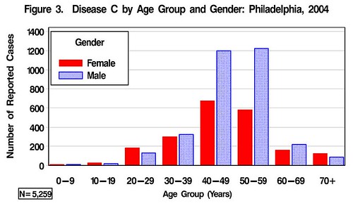
title f=swissb height=12pt "Figure 3. Disease C by Age Group and Gender: Philadelphia,
2004";
footnote1 " ";/*Empyt footnotes leave room at bottom of graph for N*/
footnote2 " ";
pattern1 value=solid color=red;
pattern2 value=x3 color=blue;
proc gchart data=discdata.arcount;
vbar sex / group=agecat
subgroup=sex /*same as chart variable (for legend)*/
patternid=subgroup /*controls when pattern changes*/
raxis=axis1 /*response axis*/
maxis=axis2 /*midpoint axis*/
gaxis=axis3 /*group axis*/
legend=legend1
annotate=anno/*references annotate dataset created above*/
autoref/*Draws reference lines for the response axis*/
clipref/*Clips reference lines at bars*/
gspace=1 /*Space between groups of bars*/
width=3; /*sets width of bars*/
format agecat agefmt.;
run;
quit;再說明一些此例用到的 GCHART 語法:
- group:指定主要分群變數名稱,此例是 agecat。
- subgroup:指定次要分群變數名稱,此例是 sex。
- patternid:指定圖例所要顯示的分群變數,此例是 subgroup(也就是 sex)。
- autoref:選擇是否顯示參考橫線。
- clipref:讓 bar 蓋在參考橫線的上面。
- gspace:控制 group 變數的間距。
- width:控制 bar 的寬度。
- legend:呼叫 legend。
- annotate:呼叫 annotate。
filename figures "d:\nesug\disease_c_nesug.png"; /*output destination*/
goptions reset=all device=png gsfname=figures htext=8pt
xpixels=3600 ypixels=2400 lfactor=6
/*settings for xpixels and ypixels generates image at 600dpi*/
/*lfactor (line factor) is increased by a factor of 6*/
xmax=6.4in ymax=3.4in hsize=6.4in vsize=3.4in;
proc greplay igout=work.gseg nofs tc=sashelp.templt template=whole;
treplay 1:gchart;
run;
quit;
此圖就很簡單地完成了。
最後,就是如何將圖輸出(如下所示),該文使用 ODS 系統來處理,有興趣的人可參考本站其他跟 ODS 相關的文章,裡面會有比較詳盡的討論。

CONTACT INFORMATION
Your comments and questions are valued and encouraged. Contact the author at:
Michael Eberhart, MPH
Philadelphia Department of Public Health
500 S. Broad Street
Philadelphia, PA 19146
Work Phone: 215-685-6603
Email: michael.eberhart@phila.gov
可否請問一下, proc gplot做圖中可否把圖的框框去掉, 只剩x軸y軸? 我找了好久都找不到, 只看到您另一篇翻譯的文章裡有看到整個用macro寫的程式裡有, but我的功力還看不太懂
回覆刪除這是 SAS 極度詭異的地方。我翻了很多 SAS 網站和手冊,在 GOPTION 中有個 noborder 的指令可以拿掉框,但經過實驗結果是沒用的。Annotate 裡面也有一個 function 可設定成 frame 來決定框的屬性。如果這功能可以使用的話,直接把 frame 的顏色和圖形底色設成一樣即可。但是我試驗了許多都沒有成功。log 裡面也沒有出現警告訊息,所以找不出來原因。最快的方法還是用 photoshop 畫白色的線蓋掉框可能比較節省時間。
回覆刪除那個 noborder 的指令我也用過了...的確沒有作用, 那麼請教, 因為我會把gplot所作之圖用ods輸出到rtf格式, 這時候可以用proc template控制得到我所要的結果嗎?
回覆刪除另外再問個問題, 在proc report中define/"abc";我想讓b變成上標要怎麼寫呢?我有看過title與footnote可以辦到, 可是用在這裡卻不行
謝謝
不好意思, 自問自答一下, 剛剛腦筋一閃又去試了一下, 其實那指令是有效的, 只是不是我要的東西, 她所謂的去框架是整張圖的(包含標題註解等等), 所以在sas本身的graph output視窗是看不出來框架, 如果指令下border然後用ods存到rtf或是其他, 就可以看出它的確是有框的, 而回去看說明內設值是noborder, 所以我們下noborder指令時會跟沒下是一樣的
回覆刪除ods rtf 會輸出所有你在 SAS 中能夠呈現的報表和圖形。所以想要讓 proc template 所產生的結果輸出到 rtf 的話,記得把 proc template 的語法包在 ods rtf; 和 ods rtf close; 裡面就可以了。
回覆刪除至於 proc report 的 subscript 的問題,有人說要看印表機的設定:
http://listserv.uga.edu/cgi-bin/wa?A2=ind0502d&L=sas-l&D=0&P=39333
但裡面還有一個連結已經失效,可是證據是指向 sas.com 的某個網頁,你可以去找看看。
In fact, SAS is going to include a new procedure for graphics in the newest version. I have the chance to use it to create some graphs. It is much better than the current SAS/GRAPH, but I still think R is more flexible on producing graphs.
回覆刪除By the way, I am studying Statistics, too. I remember you said that you don't like microarray as a research topic. Would you mind to tell me why not? I have to decide on my Ph.D advisor right now and one of a few professors I am considering is doing microarray. I am not familiar with microarray at all. Thanks.
To Turtle,
回覆刪除R的確是不錯的繪圖軟體,但如果先使用SAS來處理繁雜的資料處理和分析之後,還要再把SAS資料檔匯出來丟進R裡面畫圖也太麻煩了。我一直在找有沒有可以把SAS和R結合的程式,也就是說SAS弄好的資料立刻呼叫R來做圖,可是沒看到類似的技術文件。不過呢,SAS->Sigmaplot->Powerpoint的程式倒是已經有人寫出來了。實在是很厲害。我有空再把那份SUGI的技術文件分享出來。
至於我的研究興趣,只能說青菜蘿蔔各有人愛。Microarray沒話講當然是目前生統最流行的研究領域之一。但我天生反骨,大家一窩風去做的事情我就不太想去做。此外我真的對Microarray一點概念都沒有,也沒有這個動力去學。所以我在找指導教授時就把那些做Microarray或genetics的老師都排除了。當然,也不會找這些人來當我的committee member。這些都是我個性使然,如果你要考慮現實面(將來學術的發展和找工作),選擇Microarry作為研究領域就不太需要擔心沒有頭路。
一點小意見僅供參考。
不好意思,又來自問自答了,經過我根性的一個一個指令慢慢試之後,原來在proc gplot的plot後面加斜線noframe就可以達到我要的結果了,原來並不是在goption那邊處理的問題,無論如何,謝謝了
回覆刪除嗯~感謝48753147的分享~
回覆刪除SAS裡面實在有太多未知的option
沒去翻個手冊可能一輩子都不知道也不會去用到
關於 48753147提到的只留下X和Y軸,可以在plot指令後面加入NOFRAME,也就是
回覆刪除proc glot;
plot x*y/NOFRAME;
run;
應該可以完成您想要的目的。
PS:寫完了才發現已經解答了~