原文載點:http://www2.sas.com/proceedings/sugi29/061-29.pdf
在使用 SAS/GRAPH 時,無論是 PROC GPLOT 或 PROC GCHART 或其他相關的程序,總會有些語法是拿來設定座標軸、線條、點、還有註釋。可是大部分是已經固定的,也就是說用來用去就只有幾個樣子,想要做比較炫一點的,基本的語法是做不到的。此時,可以將一些額外的設定寫進一個資料集裡面,然後用 annotate 的指令把資料集叫進來。但 annotate 資料集的寫法很複雜,學習起來也很困難。Brian Fairfield-Carter 在 2003 年的 SUGI 29 上發表了一些 macro,讓使用者可以用比較簡單的方式來設定自己想要的圖形樣式。
在說明 Brain 的程式前,先講一個 SAS 內部可以立刻使用不需任何外掛的 macro。由於我找遍各種網站都找不到這個 macro 的使用方法,所以姑且從 Brain 給的例子中來猜一猜。語法是 %line。例如:
上面這一行代替的是下面這段程式:
所以我猜測,%line 後面的變數依序是:X1,Y1,X2,Y2,顏色、線的種類、線的寬度。
使用方法是搭配 %annomac 這個指令,如下所示:
Brain 提供了三個 macro,分別是 %AXIS、%CHART 和 %PLOT。
%AXIS 的原始碼如下:
參數解釋如下:
pg_scale =繪圖頁面大小
y_lab =Y軸標籤
y_max =Y軸最大值
y_major =Y軸大trick的間距,
y_minor =Y軸小trick的間距,
x_lab =X軸標籤,
x_max =X軸最大值,
x_major =X軸大trick的間距,
x_minor =X軸小trick的間距
%CHART 的原始碼如下:
參數解釋如下:
data_ = 資料集名稱
grp_ = 大 group 變數
subgrp_ = 小 group 變數(如果只有一個 group 變數,此參數可空白)
var_ = 要拿來畫圖的目標變數
e_bar = 要拿來畫 error bar 的變數(通常是目標變數的標準差)
bar_labl = bar的標籤
pg_scale = 繪圖頁面大小
ymax = Y軸最大值
format_ =不知道是什麼東西的格式,但 macro 內已經預設是 8。
%PLOT 的原始碼如下:
參數解釋如下:
data_ = 資料集名稱
grp_ = 大 group 變數
subgrp_ = 小 group 變數(如果只有一個 group 變數,此參數可空白)
var_ = 要拿來畫圖的目標變數
e_bar = 要拿來畫 error bar 的變數(通常是目標變數的標準差)
bar_labl = bar的標籤
pg_scale = 繪圖頁面大小
ymax = Y軸最大值
眼尖的可以發現, %CHART 和 %PLOT 的參數完全一樣,唯一的差別在 %CHART 多了一個 format_ 指令。但兩者表現出來的圖形截然不同,可看下面的例子。
基本使用方法:
步驟一:隨便做一個暫存的資料檔(_null_)並把標題和註腳寫入,如下所示:
步驟二:把想要畫在圖上的變數的一些基本統計量先跑一跑並把結果另存出來:
步驟三:啟動 annotate 的 macro 模式,並做出 annotate 的資料集:
步驟四:上個步驟會製造出兩個新資料,分別是 axis_ 和 anno_。把他們堆起來變成一個新資料集,取名為 final:
步驟五:啟動 goptions 指令並設定整個 SAS/GRAPH 的環境模式和輸出模式(此例是輸出成 CGM 檔):
步驟六:設定圖形輸出的路徑和檔名:
步驟七:把圖畫出來。
步驟八:把輸出圖檔放入 word 裡面。
最後的第八步驟其實要安裝一個 .vbs 的程式才能執行,原文裡面並沒有提供載點,只有提供原始碼,要使用者自己去做這個檔案並且放入指定路徑內。但我們可用手動的方式把圖檔叫入 word 裡面,這可能還比較方便些。方法是:
工具列 -> 插入 -> 圖片 -> 從檔案 -> 找到圖片存在路徑 -> 點選圖片檔名 -> 確認
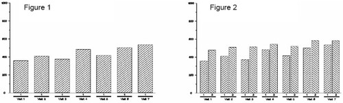
上面的方法大概可以跑出一些如下基本型態的圖(雖說很基本,但若用原本的 SAS/GRAPH 語法可是要寫很長),差別只在於放進的 group 或 subgroup 不同罷了。
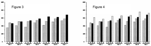
要做酷一點的,就像下面這張圖:
原本的程式要上百行,現在十行以內搞定(在步驟三):
要畫張折線圖,像下面這樣:
原本也是要幾十行,現在一行搞定(在步驟三):
如果要把上兩張圖重疊起來,像這樣:
基本上用土法煉鋼的方法,大概會寫程式寫到昏天暗地。現在也只要兩行(在步驟三):
看起來相當方便,但也是要熟悉內部參數設定和操作才行。
CONTACT INFORMATION
Your comments and questions are valued and encouraged. Contact the author at:
Brian Fairfield-Carter
PRA International
600-730 View Street
Victoria, BC, Canada V8W 3Y7
Work Phone: (250) – 480 - 0818
Fax: (250) – 480 - 0819
Email: FairfieldCarterBrian@PRAIntl.com
Web: www.prainternational.com
在使用 SAS/GRAPH 時,無論是 PROC GPLOT 或 PROC GCHART 或其他相關的程序,總會有些語法是拿來設定座標軸、線條、點、還有註釋。可是大部分是已經固定的,也就是說用來用去就只有幾個樣子,想要做比較炫一點的,基本的語法是做不到的。此時,可以將一些額外的設定寫進一個資料集裡面,然後用 annotate 的指令把資料集叫進來。但 annotate 資料集的寫法很複雜,學習起來也很困難。Brian Fairfield-Carter 在 2003 年的 SUGI 29 上發表了一些 macro,讓使用者可以用比較簡單的方式來設定自己想要的圖形樣式。
在說明 Brain 的程式前,先講一個 SAS 內部可以立刻使用不需任何外掛的 macro。由於我找遍各種網站都找不到這個 macro 的使用方法,所以姑且從 Brain 給的例子中來猜一猜。語法是 %line。例如:
%line(10,10,90,10,black,1,.20);上面這一行代替的是下面這段程式:
IF "black" =: '*' THEN ;ELSE color = "black" ;
X = 10;Y = 10;FUNCTION = "MOVE ";output;;
X = 90;Y = 10;LINE = 1;SIZE = .20;
IF "black" =: '*' THEN ;ELSE color = "black" ;
FUNCTION = "DRAW ";output;;
所以我猜測,%line 後面的變數依序是:X1,Y1,X2,Y2,顏色、線的種類、線的寬度。
使用方法是搭配 %annomac 這個指令,如下所示:
%annomac;
data anno_;
%line(10,10,90,10,black,1,.20);
run;
Brain 提供了三個 macro,分別是 %AXIS、%CHART 和 %PLOT。
%AXIS 的原始碼如下:
%macro axis(pg_scale=,y_lab=,y_max=,y_major=,y_minor=,
                                 x_lab=,x_max=,x_major=,x_minor=);
   %*declare scaling functions;
   %macro func1(axis,arbitrary);
     &arbitrary ((i*&&&axis._major)/&&&axis._max)*&pg_scale
   %mend func1;
   %macro func2(axis);
     ((j*&&&axis._minor)/&&&axis._max)*&pg_scale
   %mend func2;
%*build annotate dataset;
data axis_;
%*(set up Annotate variable attributes);
length function color style $8. text $50.;
retain xsys '2' ysys '2' when 'a' line 1
function 'label' hsys '3' size .2;
%*(create x-axis baseline);
%line(10,10,90,10,black,1,0.2);
%*(create y-axis baseline);
%line(10,10,10,90,black,1,0.2);
%*(create major y-axis tick marks - unit increments from 0 to maximum number of
increments);
%if &y_max > 0 %then %do;
 do i=0 to &y_max/&y_major by 1;
 %line(10,%func1(y,10+),9.2,%func1(y,10+),black,1,0.2);
%*(create minor y-axis tick marks - unit increments from 0 to size of major
divisions);
   do j=0 to &y_major;
     if (%func1(y,10+) + %func2(y)) <
       (10+(((&y_max/&y_major)*
       &y_major)/&y_max)*&pg_scale) then do;
       %line(10,%func1(y,10+)+%func2(y),9.6,
       %func1(y,10+)+%func2(y),black,1,0.2);
   end;end;
%*(label major y-axis tick marks);
   %label(7,%func1(y,10.5+),compress(i*&y_major),black,0,0,2,swiss,);
   end;%end;
%*(create major x-axis tick marks - unit increments from 0 to maximum number of
increments);
%if &x_max > 0 %then %do;
 do i=0 to &x_max/&x_major by 1;
 %line(%func1(x,10+),10,%func1(x,10+),9.2,black,1,0.2);
%*(create minor x-axis tick marks - unit increments from 0 to size of major
divisions);
   do j=0 to &x_major;
      if (%func1(x,10+) + %func2(x)) <
         (10+(((&x_max/&x_major)*
         &x_major)/&x_max)*&pg_scale) then do;
         %line(%func1(x,10+),10,
         %func1(x,10+),9.6,black,1,0.2);
   end;end;
%*(label major x-axis tick marks);
     %label(%func1(x,10.5+),7,compress(i*&x_major),black,0,0,2,swiss,);
   end;%end;
%*(create x- and y-axis labels;
%label(2,50,"&y_lab",black,90,0,2,swiss);
%label(50,2,"&x_lab",black,0,0,2,swiss);
run;
%mend axis;
參數解釋如下:
pg_scale =繪圖頁面大小
y_lab =Y軸標籤
y_max =Y軸最大值
y_major =Y軸大trick的間距,
y_minor =Y軸小trick的間距,
x_lab =X軸標籤,
x_max =X軸最大值,
x_major =X軸大trick的間距,
x_minor =X軸小trick的間距
%CHART 的原始碼如下:
%macro chart(data_=,grp_=,subgrp_=,var_=,e_bar=,bar_labl=,pg_scale=,ymax=,format_=8);
%let style_list=R3 L3 S R1 L1 R2 L2;%*list of bar fill styles to be assigned to
subgroups;
%*get number of groups and subgroups;
%*note that only a single record is expected per subgroup within each group;
%local ngrp nsubgrp;
proc sql noprint;
select count(&subgrp_) %if &grp_ ne '' %then %do;, count(unique &grp_) %end;
into :nsubgrp %if &grp_ ne '' %then %do; ,:ngrp %end;
from &data_;
quit;
%put number of groups= &ngrp number of subgroups= &nsubgrp;
proc sort data=&data_;
by %if &grp_ ne '' %then %do; &grp_ %end; &subgrp_;
run;
%*Declare scaling functions such that x and y coordinates are scaled according to
the number of groups and subgroups, and to the proportion of the page taken up by
the axis;
%let xscale1=space+12+((gr_strt-1)*(barspc+barwidth));
%let xscale2=space+12+((gr_end-1)*(barspc+barwidth)+barwidth);
%let xscale3=space+12+((_n_-1)*(barspc+barwidth));
%let xscale4=space+12+((_n_-1)*(barspc+barwidth)+barwidth);
%let xscale5=space+12+barwidth/2+((_n_-1)*(barspc+barwidth));
%let xscale6=space+12+barwidth/2+((gr_strt-1+gr_end-1)/2*(barspc+barwidth));
%let xscale7=space+12+0.5+barwidth/2+((_n_-1)*(barspc+barwidth));
%let xscale8=space+12-0.5+barwidth/2+((_n_-1)*(barspc+barwidth));
%let yscale1=10+&var_*&pg_scale/&ymax;
%let yscale2=10+(&var_-&e_bar)*&pg_scale/&ymax;
%let yscale3=10+(&var_+&e_bar)*&pg_scale/&ymax;
%*Build Annotate dataset;
data anno_;
set &data_;
by %if &grp_ ne '' %then %do; &grp_ %end; &subgrp_;
length function color style $8. text $50.;
retain xsys '2' ysys '2' when 'a' line 1 function 'label' hsys '3' size .2;
retain space 0;%*(for extra space between groups of bars);
retain gr_strt gr_end 0;%*(for group label and underline on x-axis);
%if &grp_ ne '' %then %do;
lgroup=lag(&grp_);
spcwidth=(0.20*&pg_scale)/&ngrp;%*(divide 20 pct of axis among group breaks);
barwidth=(0.70*&pg_scale)/&nsubgrp;%*(divide 70 pct of axis among bars);
barspc=(0.10*&pg_scale)/&nsubgrp;%*(divide 10 pct of axis among bar breaks);
%end;
%if &grp_ = '' %then %do;
barwidth=(0.76*&pg_scale)/&nsubgrp;%*(divide 76 pct of axis among bars);
barspc=(0.20*&pg_scale)/&nsubgrp;%*(divide 20 pct of axis among bar breaks);
%end;
if barwidth > 12 then barwidth=12;%*(set a constraint on the maximum bar width);
%if &grp_ ne '' %then %do;
%*(increment group break);
if _n_ ne 1 and &grp_ ne lgroup then space+spcwidth;
if first.&grp_ then gr_strt=_n_;
if last.&grp_ then do;
%*(create x-axis group labels and underlines);
gr_end=_n_;
%line(&xscale1, 6.7, &xscale2, 6.7,black,1,.6);
%label(&xscale6, 5,
left(trim(put(&grp_,&format_..))),black,0,0,2,swiss,);
end;
%end;
%*(create histogram bars);
%bar(&xscale3, 10, &xscale4, &yscale1, black, 0, );
%if &e_bar ne '' %then %do;
%*(create error bars...);
%line(&xscale5, &yscale3, &xscale5, &yscale2, red, 1, .2);
%*(...and error bar caps);
%line(&xscale7, &yscale3, &xscale8, &yscale3, red, 1, .2);
%line(&xscale7, &yscale2, &xscale8, &yscale2, red, 1, .2);
%end;
%*(create bar labels);
%if &bar_labl=1 %then %do;
%label(&xscale5, 9, compress(&subgrp_), black, 0, 0, 2, swiss,);
%end;
run;
%*because bar fill style can only be passed as a literal, specific bar style
for each subgroup must be set in an additional step;
data anno_;
set anno_;
if function="BAR" then style=scan("&style_list",&subgrp_);
run;
%mend chart;
參數解釋如下:
data_ = 資料集名稱
grp_ = 大 group 變數
subgrp_ = 小 group 變數(如果只有一個 group 變數,此參數可空白)
var_ = 要拿來畫圖的目標變數
e_bar = 要拿來畫 error bar 的變數(通常是目標變數的標準差)
bar_labl = bar的標籤
pg_scale = 繪圖頁面大小
ymax = Y軸最大值
format_ =不知道是什麼東西的格式,但 macro 內已經預設是 8。
%PLOT 的原始碼如下:
%macro plot(data_=,grp_=,subgrp_=,var_=,e_bar=,bar_labl=,pg_scale=,ymax=);
%let offset=0.75;%*to set horizontal offset between lines;
%*get number of groups and subgroups;
%local ngrp nsubgrp;
proc sql noprint;
select count(unique &subgrp_) %if &grp_ ne '' %then %do; ,count(unique &grp_)
%end;
into :nsubgrp %if &grp_ ne '' %then %do; ,:ngrp %end;
from &data_;
quit;
%put number of groups= &ngrp number of subgroups= &nsubgrp;
%*for each record, capture the value on the next record;
proc sql;
create table &data_ as select *, 1 as dummy from &data_
order by %if &grp_ ne '' %then %do; &grp_, %end; &subgrp_;
create table &data_ as select *, monotonic(&var_) as rec_ from &data_;
create table &data_ as select l.*, r.next from
(select *, rec_ as rec_l from &data_) as l left join
(select &var_ as next, rec_ as rec_r from &data_) as r
on rec_r-rec_l=1 order by %if &grp_ ne '' %then %do; &grp_, %end; &subgrp_;
quit;
%*declare scaling functions;
%macro func1(arbitrary);
&i*&offset+12+((_n_-1)*spcwidth)&arbitrary
%mend func1;
%macro func2;
&i*&offset+12+((_n_)*spcwidth);
%mend func2;
%macro func3(operator);
10+(&var_&operator&e_bar)*&pg_scale/&ymax
%mend func3;
%macro func4(vr);
10+(&vr)*&pg_scale/&ymax
%mend func4;
%do i = 1 %to &ngrp;
%*(create one output dataset per group);
data anno_&i;
set &data_;
%if &grp_ ne '' %then %do; if &grp_ = &i; %end;
run;
data anno_&i;
set anno_&i;
by dummy;
length function color style $8. text $50.;
retain xsys '2' ysys '2' when 'a' line 1 function 'label' hsys '3' size .2;
%*(divide 95 pct of axis among subgroup divisions);
spcwidth=0.95*&pg_scale/(&nsubgrp-1);
%*(create error bars...);
%if &e_bar ne '' %then %do;
%line(%func1(),%func3(+),%func1(),%func3(-),black,&i,.1);
%*(...and error bar caps);
%line(%func1(-0.4),%func3(+),%func1(+0.4),%func3(+),black,1,.1);
%line(%func1(-0.4),%func3(-),%func1(+0.4),%func3(-),black,1,.1);
%end;
if not last.dummy then do;
%*(create lines between data values);
%line(%func1(),%func4(&var_),%func2,%func4(next),black,&i,0.4);
end;
%if &i=1 %then %do;
%*(create x-axis group labels);
%label(%func1,9,compress(&subgrp_),black,0,0,2,swiss,);
%end;
run;
%end;
%*stack by-group data sets;
data anno_;
set %do i = 1 %to &ngrp; anno_&i %end;;
run;
%mend plot;
參數解釋如下:
data_ = 資料集名稱
grp_ = 大 group 變數
subgrp_ = 小 group 變數(如果只有一個 group 變數,此參數可空白)
var_ = 要拿來畫圖的目標變數
e_bar = 要拿來畫 error bar 的變數(通常是目標變數的標準差)
bar_labl = bar的標籤
pg_scale = 繪圖頁面大小
ymax = Y軸最大值
眼尖的可以發現, %CHART 和 %PLOT 的參數完全一樣,唯一的差別在 %CHART 多了一個 format_ 指令。但兩者表現出來的圖形截然不同,可看下面的例子。
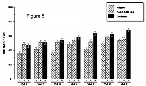
基本使用方法:
步驟一:隨便做一個暫存的資料檔(_null_)並把標題和註腳寫入,如下所示:
data _null_;
file “c:\WUTemp\test summary stats.doc”;
put “SPONSOR – PROTOCOL 1234-5678”;
...
run;
步驟二:把想要畫在圖上的變數的一些基本統計量先跑一跑並把結果另存出來:
proc univariate data=test noprint;
var val_;
output out=statout n=n mean=mean stdmean=sem_mean std=sd;
by trt visit;
run;
步驟三:啟動 annotate 的 macro 模式,並做出 annotate 的資料集:
%annomac;
%axis(pg_scale=80,y_lab=Mean Value +/-1SEM,y_max=1000,y_major=200,y_minor=100,x_lab=Treatment/Visit,x_max=,x_major=,x_minor=);
%chart(data_=statout,grp_=visit,subgrp_=trt,var_=mean,e_bar=sem_mean,bar_labl=1,pg_scale=80,ymax=1000,format_=grptype);
步驟四:上個步驟會製造出兩個新資料,分別是 axis_ 和 anno_。把他們堆起來變成一個新資料集,取名為 final:
data final;
set axis_ anno_;
run;
步驟五:啟動 goptions 指令並設定整個 SAS/GRAPH 的環境模式和輸出模式(此例是輸出成 CGM 檔):
goptions device=cgmmw6c gsfname=grafout gsfmode=replace ftext=centb rotate=landscape;步驟六:設定圖形輸出的路徑和檔名:
filename grafout "c:\sas\sasuser\temp.cgm";步驟七:把圖畫出來。
proc gslide annotate=final gout=grafout;
run;quit;
步驟八:把輸出圖檔放入 word 裡面。
x 'c:\winnt\system32\wscript.exe c:\WUTemp\word_arg.vbs "c:\WUTemp\test summary
stats.doc" 4';
最後的第八步驟其實要安裝一個 .vbs 的程式才能執行,原文裡面並沒有提供載點,只有提供原始碼,要使用者自己去做這個檔案並且放入指定路徑內。但我們可用手動的方式把圖檔叫入 word 裡面,這可能還比較方便些。方法是:
工具列 -> 插入 -> 圖片 -> 從檔案 -> 找到圖片存在路徑 -> 點選圖片檔名 -> 確認
上面的方法大概可以跑出一些如下基本型態的圖(雖說很基本,但若用原本的 SAS/GRAPH 語法可是要寫很長),差別只在於放進的 group 或 subgroup 不同罷了。
要做酷一點的,就像下面這張圖:
原本的程式要上百行,現在十行以內搞定(在步驟三):
%axis(pg_scale=80,y_lab=Mean Value +/- 1SEM,y_max=1000,y_major=200,y_minor=100,x_lab=Treatment/Visit,x_max=,x_major=,x_minor=);
%chart(data_=statout,grp_=visit,subgrp_=trt,var_=mean,e_bar=sem_mean,bar_labl=1,pg_scale=80,ymax=1000,format_=grptype);
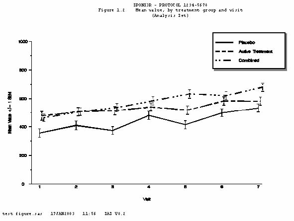
%legend;要畫張折線圖,像下面這樣:
原本也是要幾十行,現在一行搞定(在步驟三):
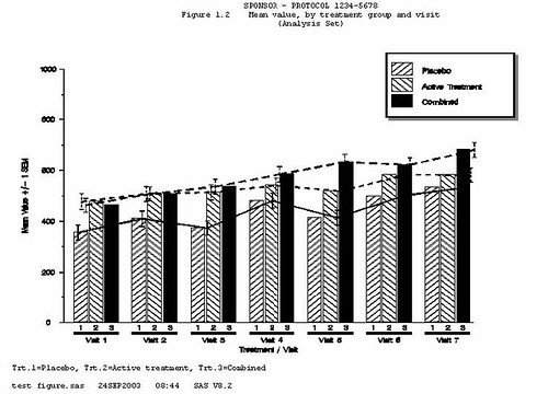
%plot(data_=statout,grp_=trt,subgrp_=visit,var_=mean,e_bar=sem_mean,bar_labl=1,pg_scale=80,ymax=1000);如果要把上兩張圖重疊起來,像這樣:
基本上用土法煉鋼的方法,大概會寫程式寫到昏天暗地。現在也只要兩行(在步驟三):
%plot(data_=statout,grp_=trt,subgrp_=visit,var_=mean,e_bar=sem_mean,bar_labl=1,pg_scale=80,ymax=1000);
%chart(data_=statout,grp_=visit,subgrp_=trt,var_=mean,e_bar='',bar_labl=1,pg_scale=80,ymax=1000,format_=grptype);
看起來相當方便,但也是要熟悉內部參數設定和操作才行。
CONTACT INFORMATION
Your comments and questions are valued and encouraged. Contact the author at:
Brian Fairfield-Carter
PRA International
600-730 View Street
Victoria, BC, Canada V8W 3Y7
Work Phone: (250) – 480 - 0818
Fax: (250) – 480 - 0819
Email: FairfieldCarterBrian@PRAIntl.com
Web: www.prainternational.com
沒有留言:
張貼留言
要問問題的人請在文章下方的intensedebate欄位留言,請勿使用blogger預設的意見表單。今後用blogger意見表單留言的人我就不回應了。